The Art of Balance and Understanding Positive and Negative Space in Floral Design
Sponsored Listings


In the world of floral design, creating arrangements that captivate and convey emotions requires more than just a selection of beautiful flowers. One of the fundamental concepts that can elevate your arrangements from good to breathtaking is the thoughtful use of positive and negative space. Understanding and mastering this balance can bring harmony, depth, and a sense of completeness to your designs.
Creating Visual Harmony
Balancing positive and negative space is crucial for achieving visual harmony in your floral designs. Too much positive space can make an arrangement look cluttered and overwhelming, while too much negative space might leave it looking sparse and unfinished. A well-balanced design ensures that each element has room to shine without overpowering the others.
Start by arranging your largest flowers first, creating a basic structure. Then, fill in with smaller blooms and foliage, paying attention to the gaps and spaces you leave.
Enhancing Focus and Emphasis
Negative space can be strategically used to draw attention to the focal points of your arrangement. By leaving space around your most striking flowers, you naturally direct the viewer’s eye towards them.
Use negative space to frame a particularly beautiful bloom or an unusual element. This technique can also be effective in highlighting the unique shape or color of a flower.
Adding Depth and Dimension
Incorporating negative space adds depth and dimension to your arrangements. It prevents the design from appearing flat and gives it a more dynamic, three-dimensional feel.
Experiment with layering different elements at varying heights and distances. This creates interesting perspectives and a sense of depth.
Use a Variety of Elements
Incorporate a mix of flowers, foliage, and other materials with different shapes, sizes, and textures. This variety naturally creates pockets of negative space.
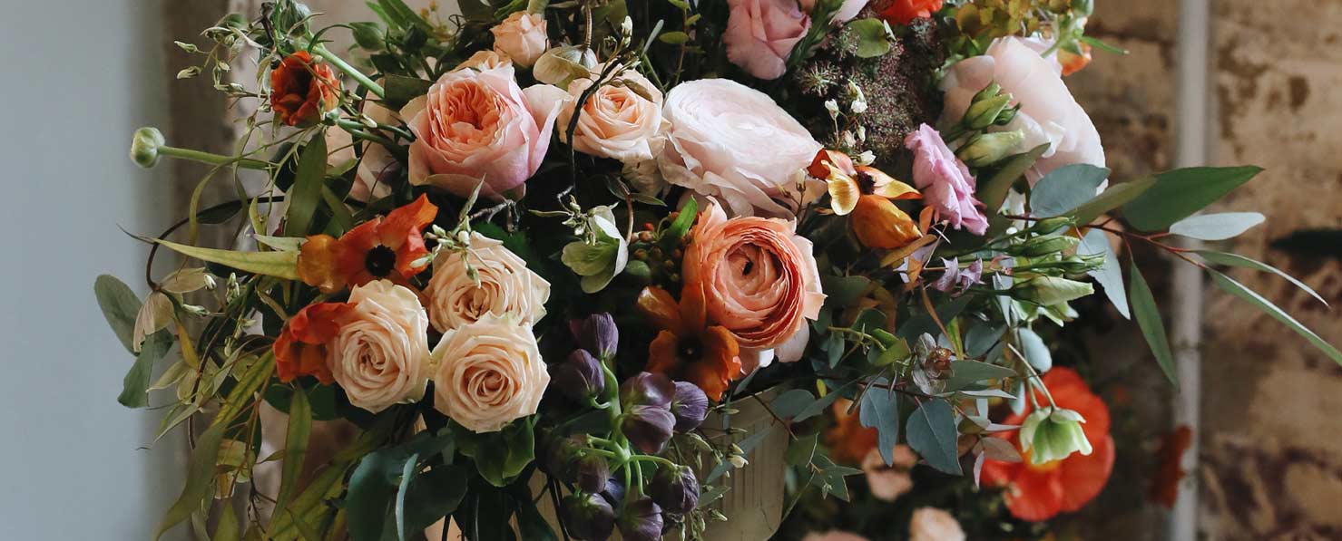
Example: Pairing large, round blooms with delicate, airy foliage can create beautiful contrasts and interesting negative spaces.
Embrace Asymmetry
Asymmetrical designs often have a more dynamic and modern feel, using negative space creatively to balance the arrangement.
Tip: Don’t be afraid to let one side of your arrangement have more negative space than the other. This can add a unique, artistic touch.
Edit Ruthlessly
When in doubt, remove a few elements. Often, less is more. A few well-placed flowers can have a greater impact than a crowded arrangement.
Tip: After completing your arrangement, take a step back and assess it from a distance. This can help you see where negative space might be needed.
Understanding and using positive and negative space effectively is an essential skill for any floral designer. By mastering this balance, you can create arrangements that are not only beautiful but also harmonious and impactful. So next time you start arranging, pay attention to the spaces you leave empty as much as the flowers you place. Your designs will breathe, bloom, and mesmerize in new ways.

 Growing Your Floral Design Business and Tips on How to Retain Weekly Client...